Hello and welcome. If you’ve found this blog, I’m sure you realize by now that I am a bright and bold photographer. I fall between light and true to color, with those bold splashes from dark and moody styles. No two photoshoots are the same. Different colors impact the overall look of the photo more than you may realize. Today we’re looking at the three main elements of how color impacts your session: wardrobe, location, and season.
WARDROBE:
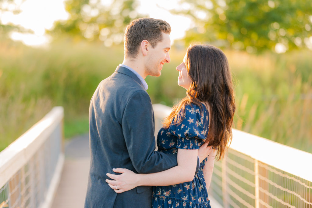
If you’ve seen some of my other blog posts, I mention color in your wardrobe a lot because it is one of the biggest factors. Colors look different on everyone. Tina and Ben chose blue tones for a few reasons, blue will be part of their wedding colors, the camera loves blue, and blue is good for their skin tones. They wanted to avoid warm tones like red and pink because of how they reflected on their skin. Red, in general, reflects strongly on skin tones, and it is not any camera’s favorite color, regardless of brand. Because of the natural red in their skin tones, they also chose locations that didn’t have red elements like red brick and wood. The blue colors help keep a natural cooler, more green tone to all of their photos.
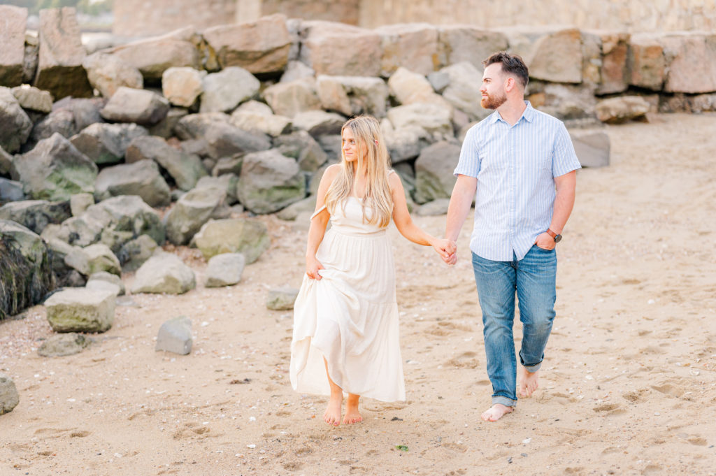
When it comes to wardrobe, I tell my clients that neutral colors will do more for them than they think. Neutral tones will not wash you out. Lighter neutrals, like white, tan, and beige, act as natural reflectors that brighten the overall image and help fill in dark shadows and spaces. Neutral wardrobes are great for any photoshoot but also for locations with many vibrant colors in the background. The contrast of your wearing neutral colors will help you pop against strong colors.
Pro tip: since the camera does not like red, I suggest muted reds like maroon and burgundy. The camera much prefers those shades of red to a true, bright red. And with my style, when I apply my edits, bright red is especially harsh.
LOCATION:
Locations are the other major factor in how any photo will look. If you have an orange reception venue, your photos will naturally appear warmer and pinker. Wedding venues that are primarily white and light-colored will have more neutral, cooler tones. It’s the same for engagement sessions. Most beaches in the US are full of tan, white, and grey colors. That will give you a more neutral and cool palette.
When you have a lot of green grass at a location in the northeast, you will get more yellow and green tones in your photos. Short grass, in particular, will reflect very strong green and yellow tones in your photos. Taller grass will actually help diffuse light, reducing those strong yellow and green colors.
At a location like the woods or a forest that is filled with deep greens, you’re going to have less light coming in. Those deep greens create a darker, moodier feel and look. Shadows are dark, and the sky is blocked by tall trees. Locations like that aren’t really the best for my style, but if you want a lot of tree foliage, you want a location where the light can breathe through the trees and where there is still an open sky. Having access to light impacts how the color will show up in the photos.
Color Impact: SEASON
Depending on what season, some colors and tones are more pronounced than others. Below is a breakdown of the general tones in each season. Note: I serve mostly the Northeast/New England area, and other locations, such as the southern and southwest states, have different seasonal patterns.
SUMMER:
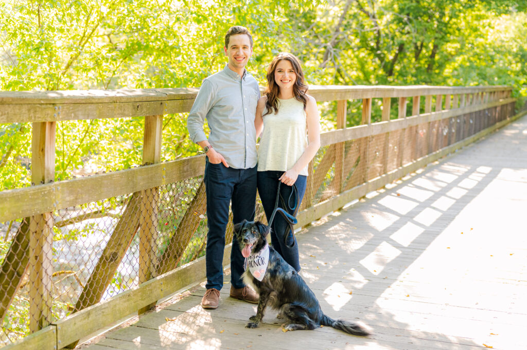
Summer has the brightest, boldest colors. The greens are the richest, and vivid colors are everywhere. Plants have grown in full, and flowers are either in full bloom or have transitioned from spring flowers to greenery. Tones in the summer are vibrant and warm. I love the light in the summer, and I’m not just biased because I’m a Leo. The sunlight is at its hottest and brightest.
Summer is the perfect time of year to get away with bold colors in your wardrobe. A lot of colors work with a summer backdrop. Think about when you go down the swimming and pool toy aisle of a store. What do you see? Bright, vivid colors! Fruity colors similar to oranges, lemons, and peaches go well with natural bright summer floral colors like pink and green. Summer is a great time for blues and greys as well since summer is associated with swimming in the ocean and pools.
FALL:
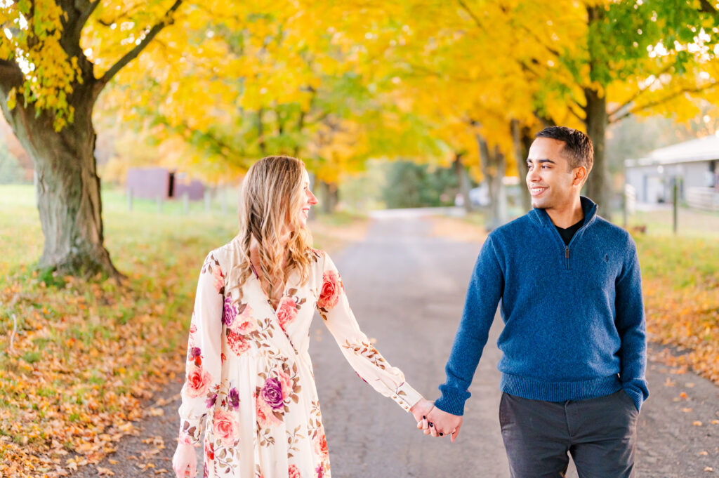
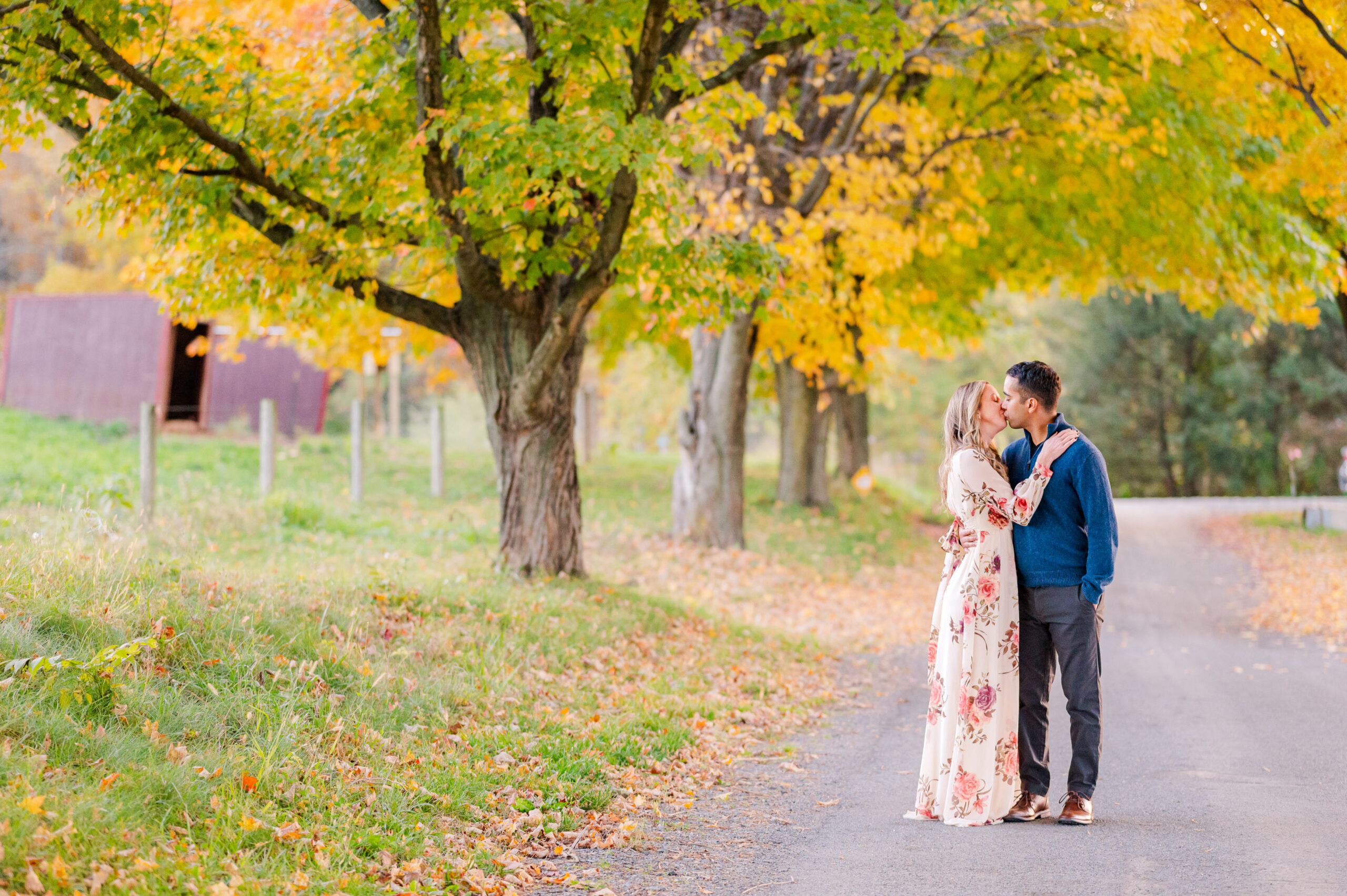
Autumn is still very bright, at least for the first half of the season. The tones are much warmer but also a little darker. Fall foliage peaks, reds, yellows, oranges, and darker greens take over landscapes. As fall transitions into winter, the fall foliage fades into a bare brown backdrop. As the days get darker, the color temperature cools, too.
Red and orange tones will be very present. Many people love the browns, maroons, and mustard yellows that go with the natural fall landscapes. This is also a great time to utilize neutral palettes for outfits. Since there are so many fall foliage tones around you, wearing neutrals will make you and the colors pop without competing with each other.
So if your session is September-Late October, think warm tones, and if your session is November to Mid-December, think cool tones. If you want a warmer, more colorful backdrop, the first half of fall will be your best friend. If you want to stand out more from the background and have the focus lean more toward the two of you, the second half of the fall will work perfectly for you.
WINTER:
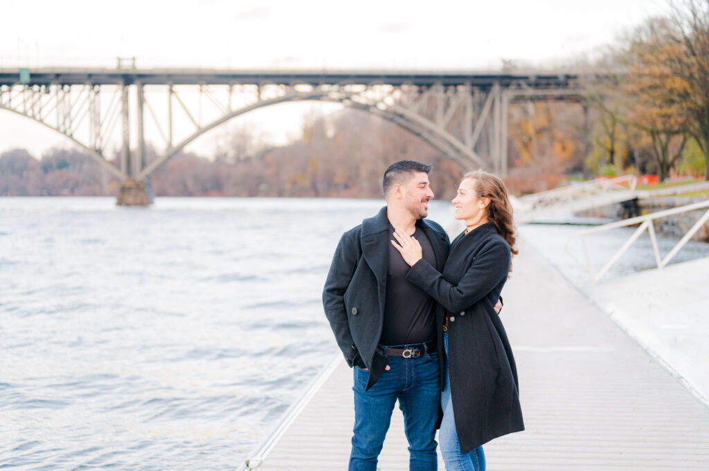
In the winter, colors are cooler overall. I shoot in Kelvin, and even if I shoot in the same place just before sunset, in each season, my kelvin temperature will be different. Winter in the Northeast leaves bare trees, cold temperatures, and a lackluster landscape. So if you’re session is during the winter months, I highly recommend locations that have more background elements like buildings, bridges, and other man-made scenery to compensate for the lack of foliage. It balances out the photo and makes you and your partner pop even more.
I always say look at the grass. Even if there is no snow on the ground, the grass is colder, lighter, and more of a cool dark green. I use tall grass and leaf-filled trees to diffuse light, so the sun can be slightly harsh. Short grass does not diffuse light, so the sun reflects the grass in your skin tones.
SPRING:
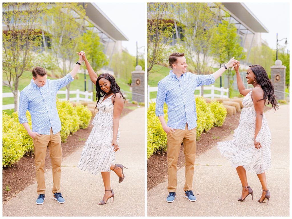
Early spring is one of my least favorite times to take pictures. That is mostly because the snow is melting, so the ground is full of mud, and the new greenery hasn’t quite come in yet. I prefer mid-spring, April-May when flowers start to bloom, and the daylight lasts longer. Mid-spring has cool tones that start warming up, like pastel pinks and blues. Greens are just coming in, so they are actually very yellow until the greenery comes in fully.
When I take spring photos, the sunlight is always a bit on the softer side. So those natural pastel colors from spring bloom in combination with the soft spring light will always make your session cooler and lighter overall. It’s a great time of year to wear fun, bright spring colors for a little extra color emphasis. As spring carries on, the colors get bolder until Summer starts.
I hope all of these tips about color help you pick out locations, outfits, and dates for your engagement session! If you are still undecided, take a look at my blog post dedicated to color palettes.
TM Grey Photo is a Wedding and Portrait Photographer, as well as a Private Editor in the New Jersey area. TM Grey Photo focuses on bright and bold stories and genuine smiles. Check out more weddings, portraits, and engagements in the gallery. Want TM Grey Photo to tell your story? Let’s chat.
Related
Mar 17, 2023
How Color Impacts Your Session and Photos
If you're new here, then let me welcome you to my blog! Taliya Michelle, here, owner of TM Grey Photo & TM Grey Events. I am a New Jersey based Wedding & Portrait Photographer and a certified Wedding & Event Planner. I of course, serve New Jersey couples, but I travel to Connecticut, New York, Eastern Pennsylvania, and wherever happy couples need their love stories told.
This is a place where I can journal about my lovely clients, what's going in my world, and of course give tips to all the future spouses and wedding vendors alike. Be sure to check my Instagram for the latest!
Hey Friend!
categories
Leave a Reply Cancel reply
You must be logged in to post a comment.
The Latest at TM Grey Photo & Events
All the latest TM Grey, including blogs on recent sessions and engagement and wedding planning, as well as updates, sales, discounts, behind-the-scenes with Taliya, and special model call sessions.
@tmgreyphoto
LET'S BE FRIENDS ON INSTAGRAM
[…] How Color Impacts Your Photos […]